How to use two axes for different order of magnitude of data in two series?
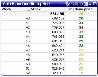
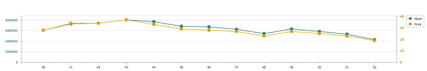
Scenario: You have to represent in a chart two series of data that are very different. For example, one is in the order of tens the other of hundreds of thousands.
Solution: Use a secondary Y-axis, and connect it to the series.
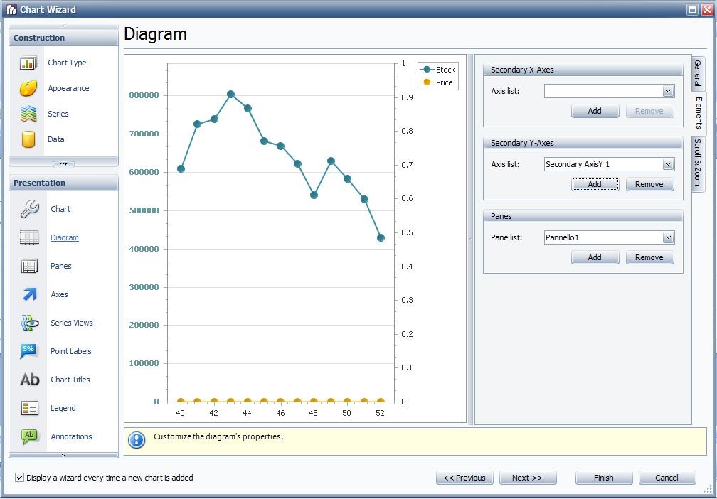
In Chart Wizard, go to Diagram and then to Elements tab, and add a secondary axis Y to the chart.
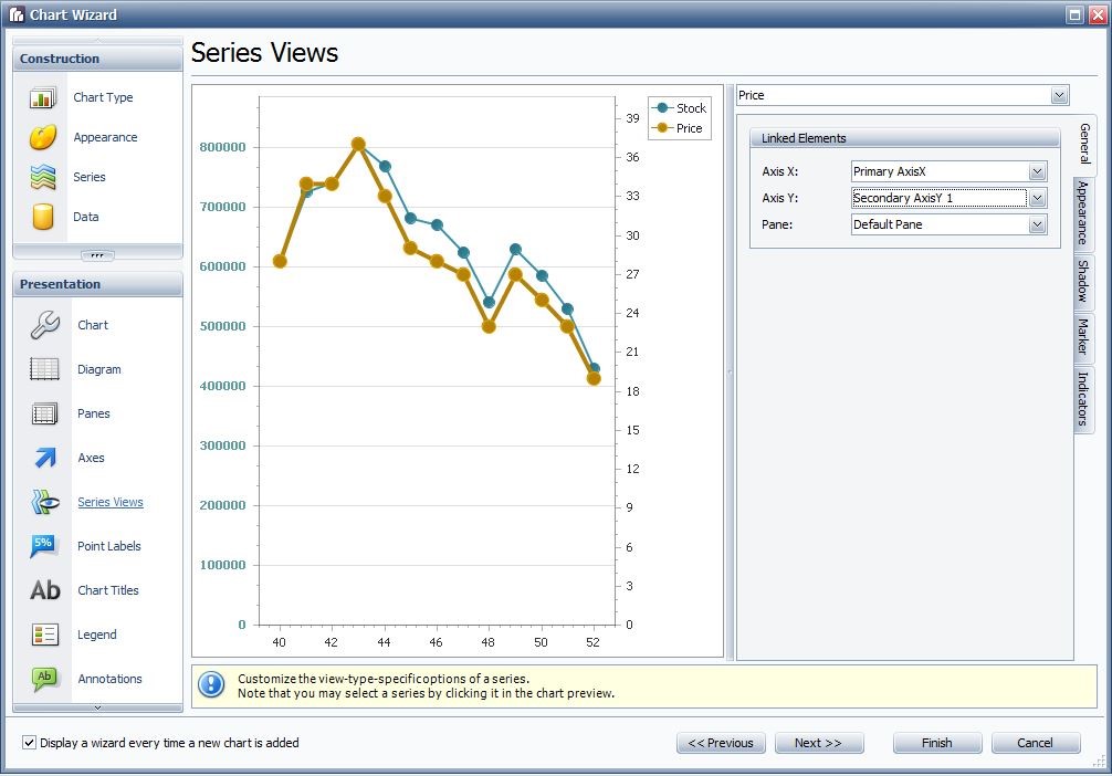
Then assign the axis to the series by going to Series Views, select the series name from the drop down menu, and assign it the desired axis.
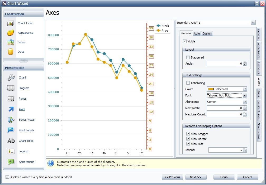
It is possible to change the colour of the labels of the axis in order to make it more clear which axis is assigned to which series, by going to axes – General – Text Settings.
And the output is the desired one:
Related Articles
How to create a chart with auto created series?
Scenario: you have this bar chart in QlikView. The straight table for it is this one, with one column for type, one for date, and one for number. You cannot use series to create that chart in BIReport, since you do not have a column for each type. ...