How to create a chart with auto created series?
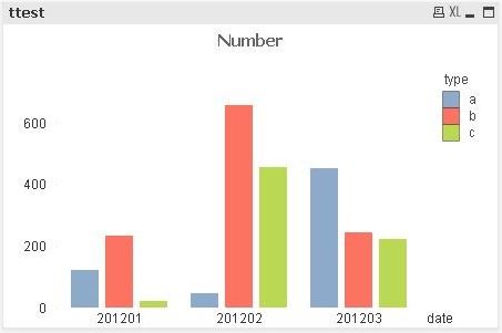
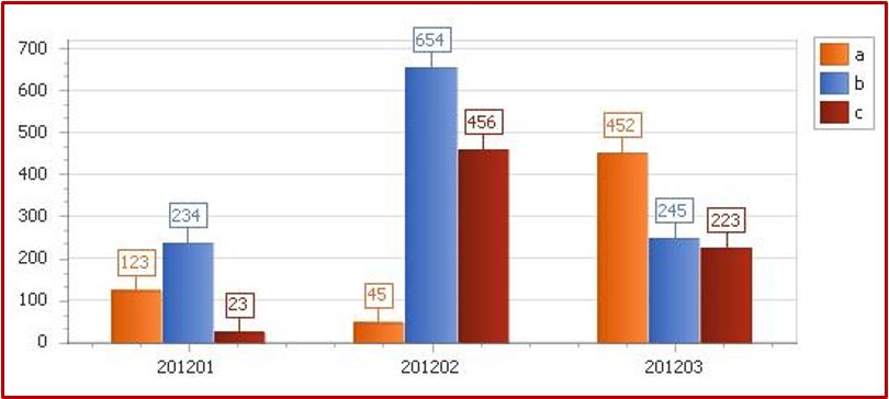
Scenario: you have this bar chart in QlikView.
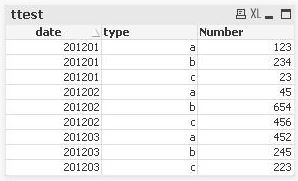
The straight table for it is this one, with one column for type, one for date, and one for number.
You cannot use series to create that chart in BIReport, since you do not have a column for each type.
Solution: create a new chart, remove the two default series and, in Data go to the tab Auto-created Series.
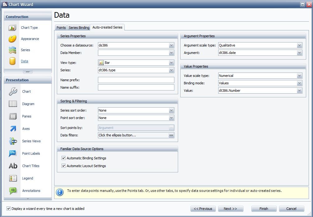
In Series drop down menu, choose the field that contains the series type of your chart, in argument and value argument and value for your chart.
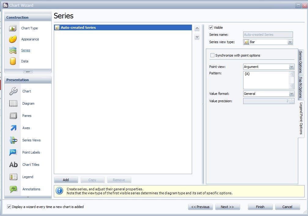
Back to Series, the auto-created series will be shown in the series list.
Go to Legend Point Options, uncheck Synchronize with point options. In point view select Argument.
Click finish, and in print preview, the output will be like this.
Related Articles
How to conditionally colour a chart?
Scenario: In a bar chart, you want each bar colour depending on its value. Solution: Add the chart to the Report, and with the chart selected go to scripts. Add the following script: // Apply different colors to the bars depending on their value ...How to create a custom summary?
Scenario: In QlikView you have a table where some of the totals are the division between two totals, or when there are percentages, so you cannot simply use the group (or report) summary. Solution 1: Use the custom summary event. Select the label ...How to create a multi-column report?
Scenario: the desired output is like this: a multicolumn output from a straight table in QlikView™ Solution: create a multicolumn layout for the detail band. Click on the little arrow on the detail band header, while the band is selected. In the ...How to add an alert label to the chart?
Scenario: In a chart, you want to show a label with an alert every time a value surpasses a defined threshold. Solution: Replicate the procedure in the previous section, using the function: private void ChangeLabelText(object sender, ...How to use two axes for different order of magnitude of data in two series?
Scenario: You have to represent in a chart two series of data that are very different. For example, one is in the order of tens the other of hundreds of thousands. Solution: Use a secondary Y-axis, and connect it to the series. In Chart Wizard, go to ...